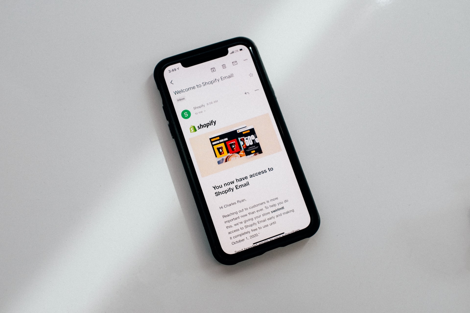
What’s the best font size for email marketing?
From “12-point font for the body text” to “20px for headlines,” email marketing experts share answers to the question, “What font size do you use for your email marketing newsletters?”
- Choosing Email Font Size is a Balancing Act
- Size 16 font for Ecommerce Newsletters
- 20px or 24px for Headlines
- 12-point Font for the Body Text
- It’s Important How Your Message Will Viewed On Devices
Choosing Email Font Size is a Balancing Act
Too large and the email content may appear distorted or out of place in the recipient’s email service provider. Too small and subscribers typically skip reading it.
Personally, I tend to opt for 16 points in the main body of the newsletters I write. This usually works well, but I will sometimes go for a larger font if the audience is predominantly mobile users (or if they are a demographic which may include older, or visually challenged readers).
Headlines and subheadlines I’ll opt for anywhere between 20 and 30 points, but I use a testing process to determine the best font size for each campaign. Both the font type and the number of words influence how large (or small) you can go.
Vicky Smith, Email Strategist and Copywriter, Flic Email
Size 16 font for Ecommerce Newsletters
We generally use size 16 fonts in most of the email marketing newsletters we produce. As an email marketing agency, we create a lot of email campaigns and find this font offers a good balance between readability and the overall look and feel of branding in an email.
Of course, you’ll also want to make sure you’re using responsive email templates too, so that text looks good on all devices and is able to change the way things are displayed for each individual user.
Ryan Turner, Founder, EcommerceIntelligence.com
20px or 24px for Headlines
For me, the font size varies for paragraphs and headlines. The minimum font size I use is 16px because this font size is readable on both desktop and mobile devices. As for the headlines (H1s, H2s), the font size varies, and I often go for 20px or 24px.
Nupur Mittal, Content Writer, Mailmodo
12-point Font for the Body Text
When it comes to the font size for an email marketing newsletter, I use 12-point font for the body text and 13.5-point font for subheadings. It ensures that the message will be large enough for readers to read comfortably but not so large that it clutters up their inboxes and makes them less likely to want to open and read it.
For best results, I also choose sans serif fonts as they are easy on the eyes and great for digital reading. By being mindful of basic design settings, I can ensure that everyone can easily digest your content without difficulty, regardless of their device type or resolution settings.
Kate Wojewoda-Celinska, Marketing Manager, Spacelift
It’s Important How Your Message Will Viewed On Devices
When it comes to choosing the font size for your email marketing newsletters, it is important to keep in mind how your message will be viewed on different devices. A good rule of thumb is to use a font size that is legible both on desktop and mobile devices, typically somewhere between 14-16 px.
It’s also best practice to use the same font size for both the body and the headline, so that your readers can easily scan through your content. Additionally, try to keep line length short, usually no more than 40 characters per line, as this will make it easier for people to read your message.
Aviad Faruz, CEO, FARUZO
Submit Your Answer
Would you like to submit an alternate answer to the question, “What font size do you use for your email marketing newsletters?”
